---
title: "Impacto de mis publicaciones"
date: 10 Jun 2024
update-date: 6 Aug 2026
editor_options:
  chunk_output_type: console
execute:
  echo: false
format:
  html:
    code-tools:
      source: true
      caption: "Código para cálculos y figuras"
---


```{r}
#| label: setup
#| warning: false
#| message: false
library(forcats)
library(tidyr)
library(cowplot)
library(ggplot2)
library(stringr)
library(dplyr)
library(magick)
```

```{r}
#| label: icons

# Original location of the icons
#icons_url <- "https://plumanalytics.com/wp-content/uploads/2015/07/"
#alternative version at > https://www.jneurophilosophy.com/index.php/jnp/announcement/view/11
# made a local copy here:
icons_url <- here::here("data","plumx")
icons <- c(citation = "Metrics_Icons_Citations.png",
  capture =  "Metrics_Icons_Captures.png",
  mention = "Metrics_Icons_Mentions.png",
  usage = "Metrics_Icons_Usage.png",
  socialMedia = "Metrics_Icons_socialMedia.png")

pngs <- sprintf("%s/%s",icons_url, icons)
names(pngs) <- names(icons)
```


```{r}
#! label: Colours

# I extracted the dominant colours for these icons using some (image-)magick:
clrs <- c()
for (nm in names(pngs)) {
  img <- image_read(pngs[nm])
  img_array <- as.integer(img[[1]])
  val1 <- as.vector(img_array[,,1])
  val2 <- as.vector(img_array[,,2])
  val3 <- as.vector(img_array[,,3])

  clrs[nm] <- rgb(median(val1[val1<250]),
                  median(val2[val2<250]),
                  median(val3[val3<250]),
                  max=255)
}
```


```{r}
#| label: descriptions for the five categories
texts <- c("citation" = "citas académicas + impacto social (e.g. 'policy citations')",
           "usage" = "interacciones digitales (e.g. clicks, descargas)",
           "capture" = "demostrar interés (e.g. favoritos, guardado para más tarde, copias)",
           "mention" = "contenido asimilado (e.g. artículos de prensa, blogs, wikipedia)",
           "socialMedia" = "“buzz”, atención y promoción (e.g. compartir, likes, commentarios)")
```


```{r}
#| warning: false
#| message: false
here::i_am("rzrch/impact.qmd")
rds_folder <- "data"

PMX_ALL <- readRDS(here::here(rds_folder,"plumx_ALL.rds")) |>
  mutate(doi = tolower(doi)) |>
  filter(!journal %in% "Therya")

# PMX_ALL |>
#  knitr::kable()
```

Existen muchas formas de medir el impacto de nuestras actividades científicas. Algunas iniciativas se basan en indicadores cuantitativos derivados de contadores y estadísticas de uso de varias redes sociales y académicas.

Uno de los más famosos proveedores es PlumX.

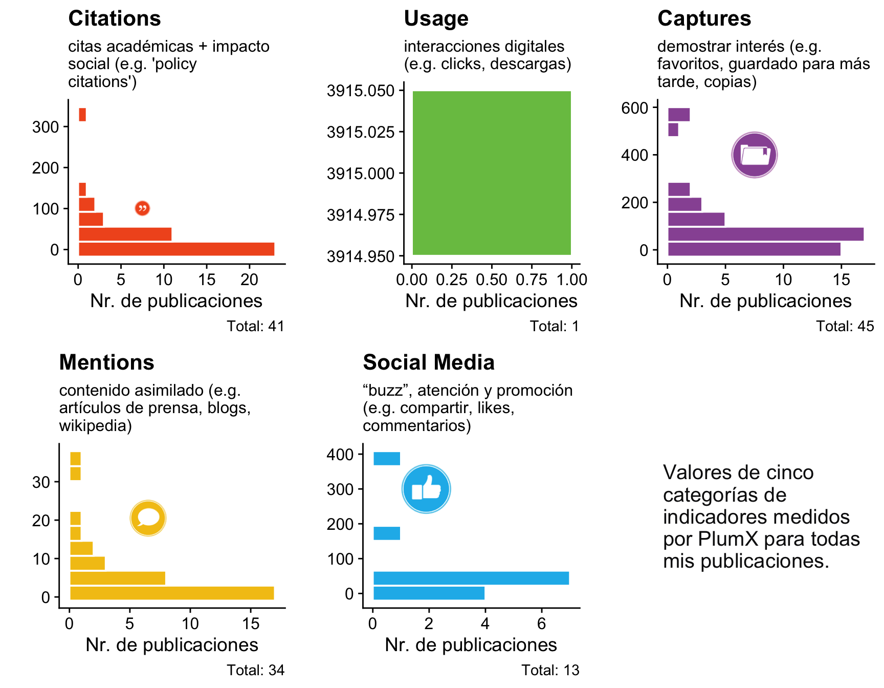
PlumX registra varios indicadores del uso e impacto de publicaciones. La descripción de las cinco categorías principales se encuentra aquí:  <https://plumanalytics.com/learn/about-metrics/>.

Los valores totales obtenidos para mi lista de publicaciones son los siguientes:

```{r}
PMX_summary <- PMX_ALL |>
  summarise(
    across(all_of(c("capture","citation","mention", "socialMedia","usage")), ~ sum(.x,na.rm=TRUE))
  )

PMX_summary |>
  knitr::kable()
```

```{r}
PMX_summary <- PMX_summary |>
  pivot_longer(cols=capture:usage)
```


```{r}
plotBlock <- function(dts, nm, lbl, xpos, ypos, scl, logy = FALSE) {
    qnm <- ensym(nm)
    flt_dts <- filter(dts,!is.na(!!qnm))
  P <- ggplot(data = flt_dts) +
    geom_histogram(aes(y = !!qnm),
        fill = clrs[nm], bins = 10, colour='white'
        ) +
    theme(legend.position = "none",
          title = element_text(color = clrs[nm]),) +
    theme_half_open() +
    labs(x = "Nr. de publicaciones", y = "",
    title = lbl, subtitle = str_wrap(texts[nm],28),
    caption = sprintf("Total: %s",nrow(flt_dts)))

  if (logy) {
    P <- P + scale_y_log10() +
      draw_image(pngs[nm], x = xpos, y = ypos, scale = scl)
  } else {
    P <- P +
    draw_image(pngs[nm], x = xpos, y = ypos, scale = scl)
  }
  return(P)
}

```

Pero probablemente sea más informativa una presentación gráfica por publicación:

```{r}
b1 <- plotBlock(PMX_ALL, "citation", "Citations", xpos=7, ypos=100, scl=40)
b2 <- plotBlock(PMX_ALL, "usage", "Usage", xpos=.25, ypos=2000, scl=1000)
b3 <- plotBlock(PMX_ALL, "capture", "Captures", xpos=7, ypos=400, scl=200)
b4 <- plotBlock(PMX_ALL, "mention", "Mentions", xpos=6, ypos=20, scl=10)
b5 <- plotBlock(PMX_ALL, "socialMedia", "Social Media", xpos=1.4, ypos=300, scl=150)
```


```{r}
b6 <- ggdraw() +
  draw_label(str_wrap("Valores de cinco categorías de indicadores medidos por PlumX para todas mis publicaciones.",20),
             hjust = 0, x = 0.25, color = "#0d0d0f", size = 15)
```


```{r}
#| fig-width: 9
#| fig-height: 7
plot_grid(
  b1,
  b2,
  b3,
  b4,
  b5,
  b6,
  ncol = 3
)
```

## Impacto social

Una forma de medir el impacto social es considerando las citas que reciben los artículos científicos en documentos de normativas y políticas nacionales o globales.

Esta es el total de mis publicaciones que tienen citas en algún instrumento de políticas globales, según los valores registrados por PlumX.

```{r}
PMX_ALL |>
  filter(!is.na(POLICY_CITED_BY_COUNT)) |>
  summarise(
    `Total documents`=n(),
    `Total policy citations`=sum(POLICY_CITED_BY_COUNT))|>
  DT::datatable(rownames = FALSE)
```


```{r}
#| eval: false
PMX_ALL |> filter(!is.na(POLICY_CITED_BY_COUNT)) |> select(author_groups, POLICY_CITED_BY_COUNT)  |>
  ggplot() +
  geom_boxplot(aes(y=POLICY_CITED_BY_COUNT,x=author_groups, fill= author_groups, alpha = author_groups), varwidth = FALSE, width=0.28) +
  geom_jitter(aes(y=POLICY_CITED_BY_COUNT,x=author_groups), width = 0.07, alpha=.35)
```

En la siguiente tabla presento una lista detallada de estas publicaciones con los enlaces a sus perfiles en PlumX.

```{r}
PMX_ALL |>
  filter(!is.na(POLICY_CITED_BY_COUNT)) |>
  transmute(
    DOI = sprintf("<a href='https://doi.org/%1$s'>%2$s</a>", doi, title),
    Plumx = sprintf("<a href='https://plu.mx/plum/a/policy_citation?doi=%1$s'>PlumX metrics</a>", doi),
            `Academic citations` = CITED_BY_COUNT,
            `Policy citations` = POLICY_CITED_BY_COUNT) |>
  DT::datatable(rownames = FALSE, escape = FALSE,
    options = list(dom = 't', order = list(3, 'desc'), pageLength = 25))
```